Latino Community Association
Branding + Collaboration
Challenge: Create a logo for the Latino Community Association. Three hours of design sprint were given for this challenge.
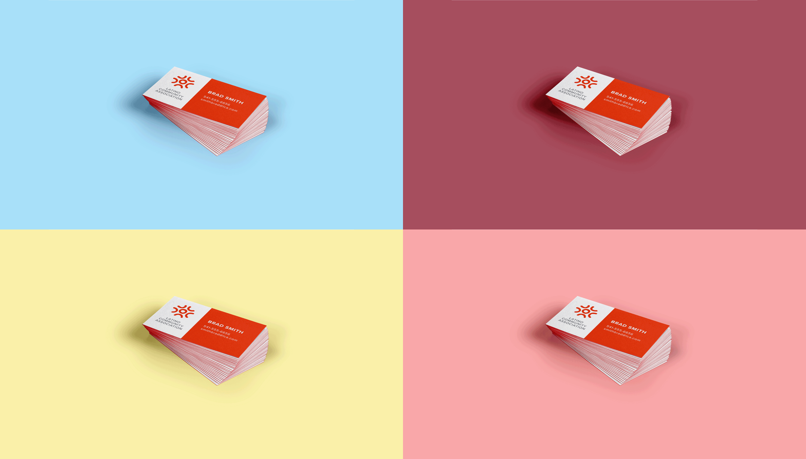
Solution: The design solution created was a logo that focused on reaching out to the Latino community in Bend, OR, as well as making a professional statement to potential donors. The sun references the Latino culture, the hand drawn elements add a sense of authenticity and genuineness, and the symbol represents a meeting place or a community of people coming together.
Collaboratively designed with Hunter Weyand.


Process
We were given a brief that the client and partner, The Visible Alliance, created for the design sprint. The brief highlighted the LCA’s audiences being the Latino community, donors, and policy makers. The brief also stated they were particular to a sun design, and that they wanted the logo to be welcoming, professional, and give a sense of community.
This project started with a round of pencil sketches - brainstorming and quickly getting ideas down on paper. Next, after we settled on the idea of this community and a group individuals creating this stylized sun graphic, we took our sketches to the computer. The end result was this hand drawn sun, made of made up of individual people coming together to form a community. The Proxima Nova type was also hand traced to give it more character and some imperfections. The handmade aspects of the logo give it a feeling of genuineness and authenticity both aspects we wanted the logo to communicate to the Latino population of Central Oregon.
Our design was chosen as the winner of the logo contest out of an initial 35 designers.


